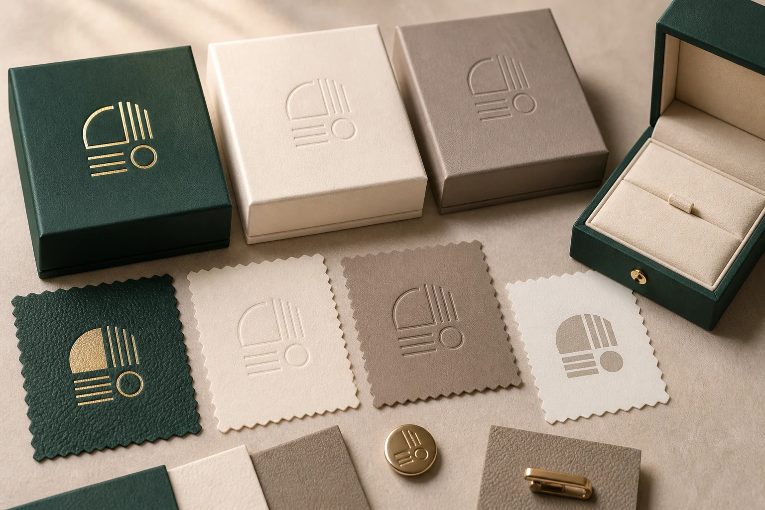
A jewelry box can have the correct size and still arrive with a misplaced logo, clipped foil stamp or a color that does not match the approved direction. A reliable artwork handoff connects the production dieline, editable artwork, finish instructions, physical sample and purchase order in one controlled approval record.
Start with the production dieline
Request a dieline for the exact box construction, insert and closure. It should identify cut, fold, bleed and safe areas, together with the orientation of every visible panel. Do not scale a dieline from a screenshot or reuse one from a different box size. Confirm whether the artwork will appear on the lid, base, sleeve, insert card or more than one component.
Name the visible orientation when the box opens. A lid logo can be correctly centered on the flat artwork yet face the wrong way in the assembled box. Add a simple assembled-view reference when the flat layout is difficult to interpret.
- Exact finished dimensions and dieline revision
- Cut, fold, bleed and safe areas
- Artwork placement and orientation on each component
- Areas covered by an insert, ribbon, magnet, hinge or sleeve
Build a clean artwork package
Provide vector artwork for logos and line work where possible. Convert fonts to outlines or include the approved font files when licensing permits. Linked images should be included at a resolution suitable for the intended print size. Keep a reference PDF alongside the editable file so the supplier can compare appearance after opening the production artwork.
Use descriptive file names instead of labels such as “final-final.” A practical name includes the product or box code, component, artwork revision and date. The revision shown in the purchase order and sample record should match the file released for production.
| Editable artwork | Vector logo, outlined text, placed images and clearly separated production layers. |
|---|---|
| Reference PDF | A view of the intended appearance, dimensions and notes for comparison. |
| Dieline | The exact construction and revision supplied for the selected packaging format. |
| Color direction | Named color reference, physical sample or approved swatch for critical brand colors. |
| Finish instructions | Method, application area, position, orientation and any acceptable production limits. |
Separate print art from finishing instructions
Mark foil stamping, embossing, debossing, spot coating and ordinary printing as distinct layers or clearly named files. Specify the intended method instead of relying on the artwork color to explain it. A gold-colored logo on screen could represent metallic foil, ordinary ink or a visual placeholder; those options do not create the same result.
Fine strokes and small text may not reproduce in foil or embossing exactly as they appear on a monitor. Review the real logo size, surface texture and selected method together. Our jewelry packaging logo finish guide explains how foil, print, emboss and deboss interact with different surfaces.
The substrate also affects ink, foil edges, relief and perceived color. Confirm the selected paper, fabric or covering before approving the logo method, and compare it with the relevant packaging material and finish options.
Check the insert with the real product
A printed proof cannot establish whether a ring, necklace or pair of earrings sits securely. Send the actual item or a dimensioned reference and specify how it should be presented when the lid opens. Review cushion thickness, slot location, removal access and any contact point that could mark or place pressure on the jewelry.
If several product sizes share one box, test the smallest and largest examples rather than only a nominal sample. Use the same approved artwork orientation while confirming that logo placement remains visually balanced with the product and insert. The separate insert fit and sample approval guide provides a product-specific checking sequence.
Approve a physical sample deliberately
Review the assembled sample in representative lighting. Check logo position, legibility, material texture, opening action, insert fit, edge quality and how every component is packed. A screen proof can verify content and placement direction, but it cannot replace a physical sample where color, texture, relief or jewelry fit matters.
Photograph the approved sample and record any accepted variation. If the sample needs changes, issue a new revision rather than relying on an email description that could be confused with the older version. State which attributes are controlled by the physical sample and which remain controlled by a numeric specification.
Appearance
Compare color direction, logo position, scale, edge quality and visible workmanship.
Function
Open the box, install and remove the jewelry, and check every included component.
Record
Identify the dieline, artwork revision, material, sample version and approved changes.
Keep the purchase order aligned
The order should reference the approved artwork, box construction, insert specification, quantity, packing method and inspection expectations. If a material or process needs to change, define who can approve the revision and which sample or document becomes the new reference.
Before bulk production, compare the final proof, physical sample and purchase order side by side. They should describe the same box, finish, insert and packing method. This handoff belongs within the broader custom jewelry packaging development process and should connect directly to the agreed quality-control checkpoints.
Artwork approval checklist
- Confirm the exact dieline and assembled orientation.
- Check spelling, contact details, symbols and required legal copy.
- Verify logo size, position and distance from cut or fold lines.
- Identify print, foil, emboss, deboss or coating layers explicitly.
- Match the artwork revision to the reference PDF and order.
- Approve critical color and texture on the intended material.
- Test the physical sample with the actual jewelry and all accessories.
- Record changes and identify the sample released for production.
Frequently asked questions
Can a PDF be used as the only production artwork?
A PDF is useful as a visual reference, but editable vector artwork is usually preferable for logos, line work and finish separation. The supplier should confirm the production-ready file required for the selected process.
Is an on-screen color proof enough?
No. Screens vary, and the final material changes how color and finish appear. Use an agreed color reference or physical sample when the result is critical.
When should the dieline be locked?
Lock the exact packaging construction and dimensions before releasing final artwork. A structural change can move panels, folds, safe areas and logo positions.
What should happen after an artwork revision?
Issue a new file revision, update the reference PDF and approval record, and confirm which earlier version is no longer valid.
To compare a packaging structure, logo method, insert and sample plan in one brief, share your custom jewelry packaging requirements with the available product dimensions, artwork and commercial information.